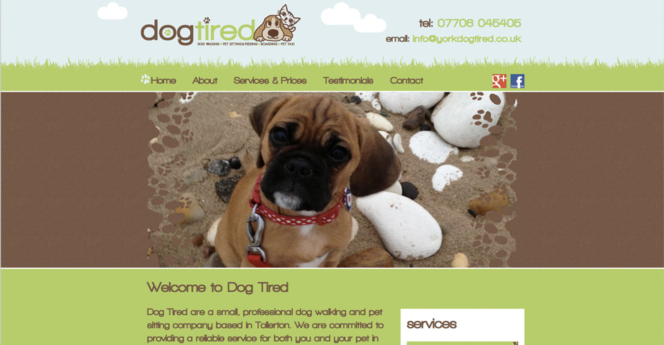
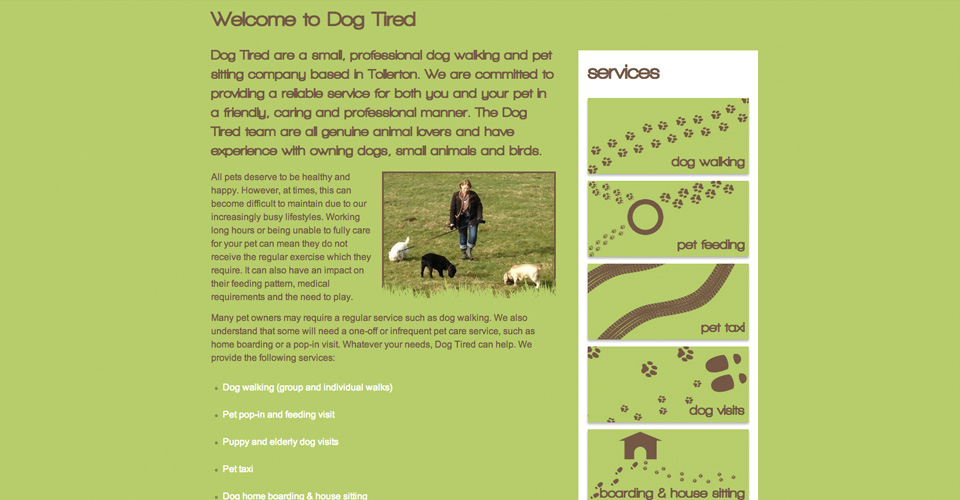
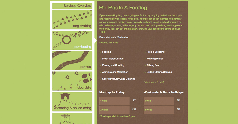
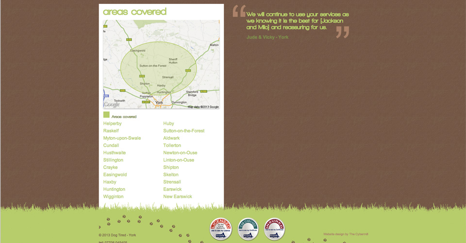
The design of this site was inspired by their logo. I took this design in a very graphical direction.
I started this project, as with most, looking at their competitors websites. I thought most of them looked a little to serious and corporate. Having talked to the owner and seen the company name, I got the idea she wanted to come across as more fun and caring.
I wanted to used large areas of colour and keep the illustrative elements going throughout the site. I also liked the idea of grass for the green and brown as mud, two elements that instantly come to mind when walking dogs. Following that train of thought, I like the idea of using paw prints to represent the different services offered by Dog Tired


